Designers, Stop! Learn These 10 Spacing Tricks Before Opening Figma!
Oleh
Irvilani
Jun 27, 2025
Design Isn’t Just About Colors: Discover 10 Types of Spacing You Might Be Ignoring
Ever feel like your design looks "off" even though the colors, fonts, and images seem perfectly fine? The problem might not be what you added—but what you didn’t space out properly. Yup, we’re talking about spacing—those subtle gaps between elements that can make or break your design. So, we’ll walk through 10 types of spacing in UI design that often go unnoticed but could be the secret sauce to leveling up your layout. Let’s break them down one by one—imagine your own design while reading along!
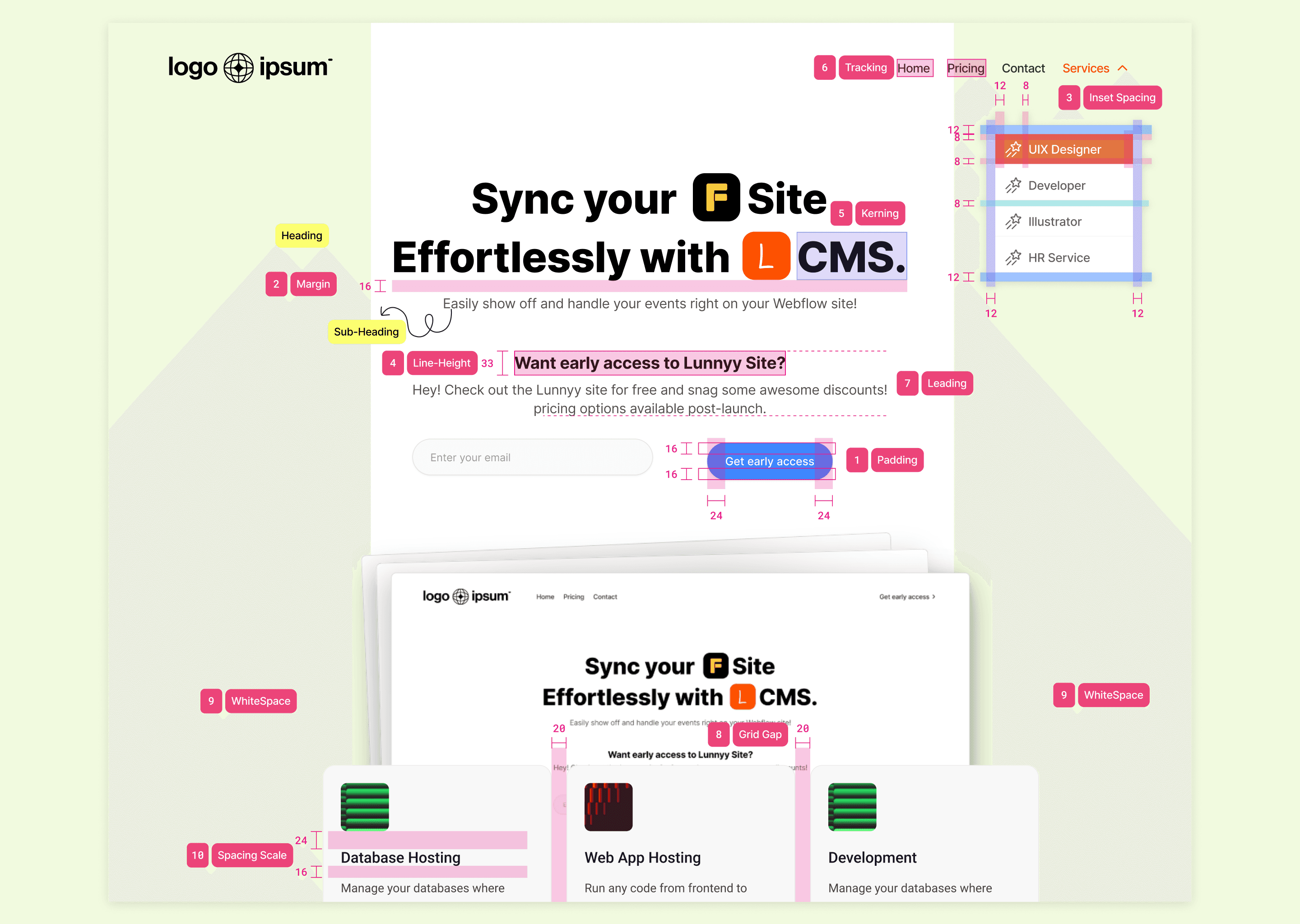
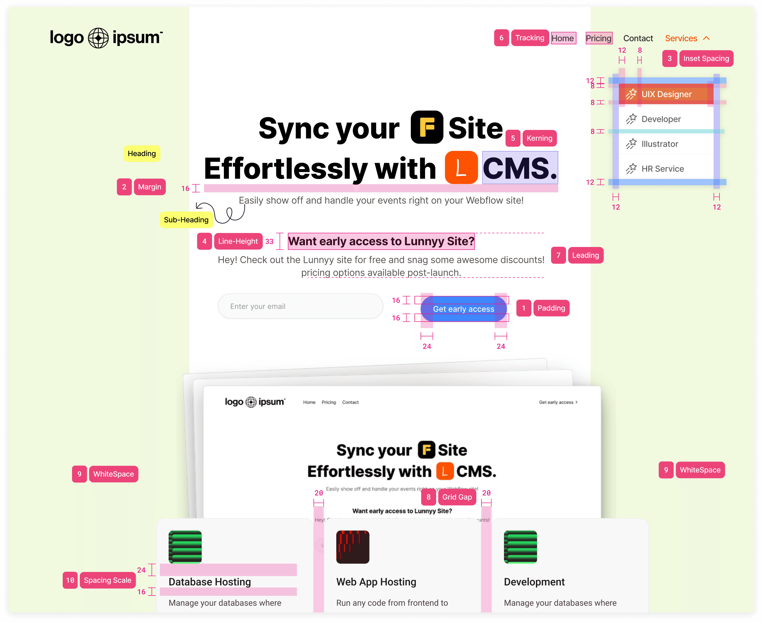
See how all 10 spacing types are implemented in a hero section.
Your Design Looks Neat, But Still Feels Messy? This Might Be Why!
Have you ever opened an app where buttons feel crammed, the text strains your eyes, or everything just seems… stuck together? That’s a clear sign of bad spacing. For example, buttons without enough padding can cause accidental taps, and headings that sit too close to body text can overwhelm the layout. A lot of junior designers tend to drag and drop in Figma without thinking about what makes spacing actually comfortable. In reality, spacing is one of the most powerful tools to create visual hierarchy and reading ease—so don’t underestimate it!
Here are some go-to spacing rules every designer should keep in their back pocket—perfect for making your layout feel clean, clear, and visually balanced.
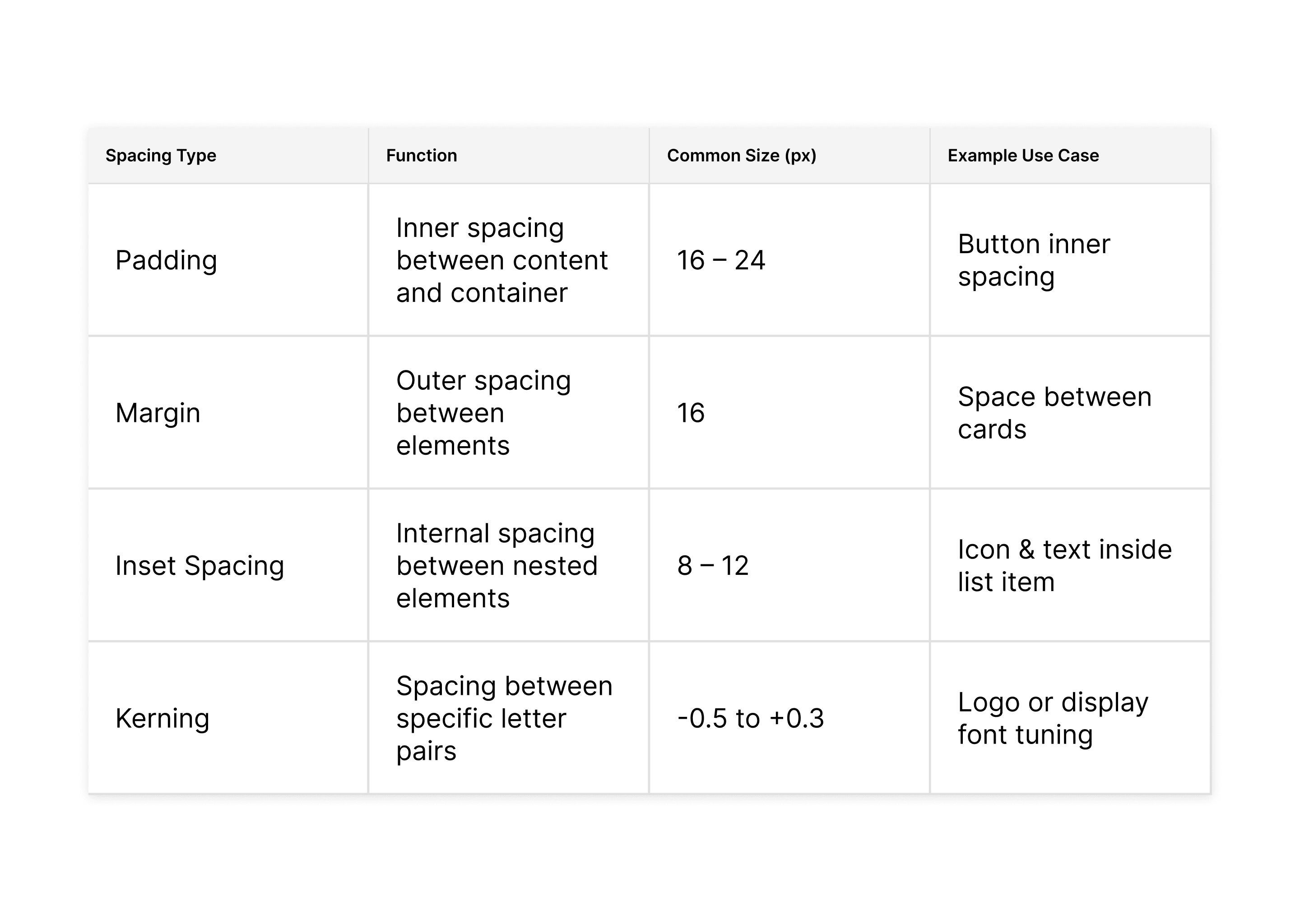
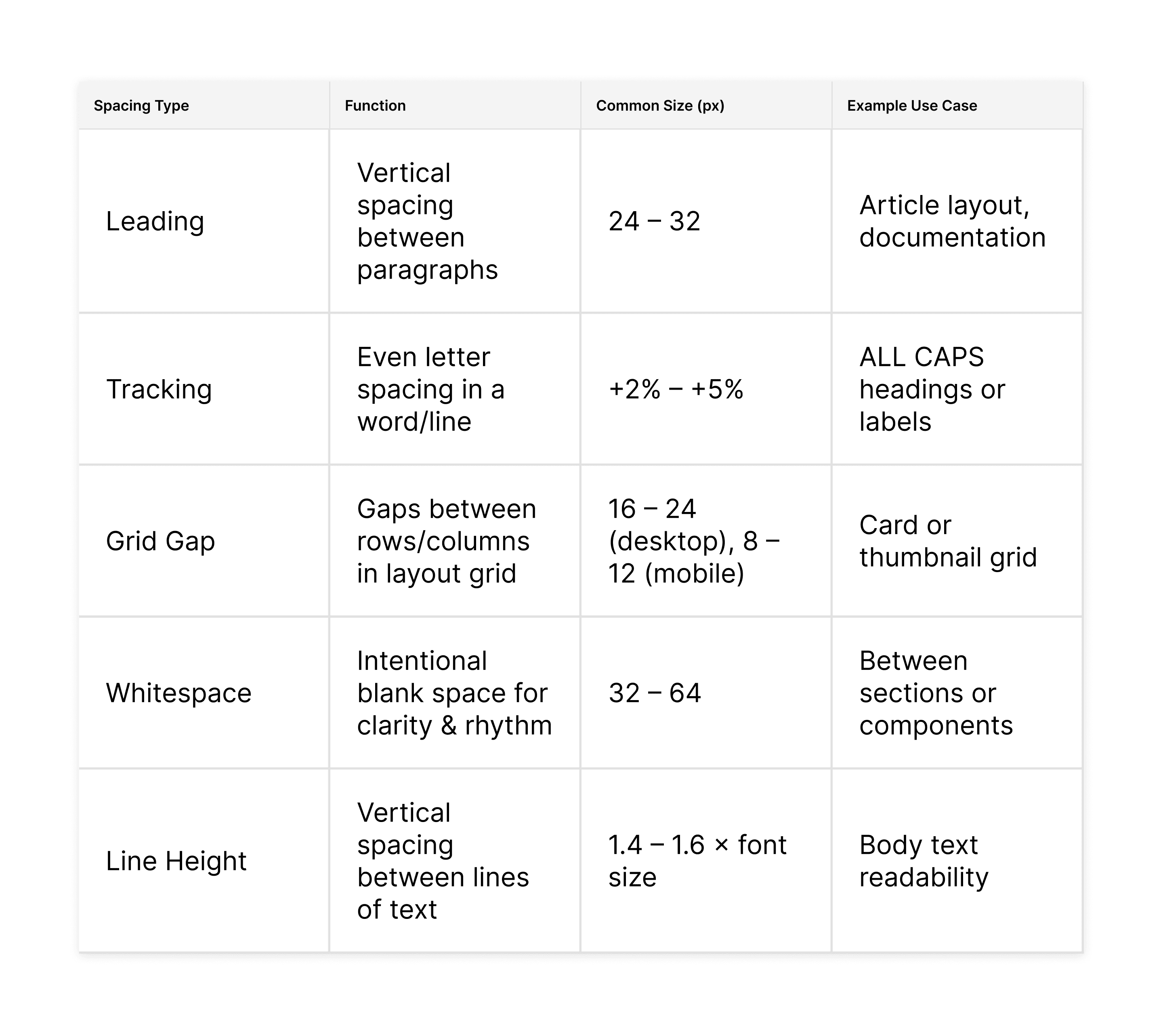
Types of Spacing in UI Design (and Why They Matter):
Padding
Space inside an element — between the content and its border. Why it matters: Makes content more comfortable to tap and visually tidy.
Margin
Space outside an element — between one element and another. Why it matters: Prevents components from colliding and keeps layouts organized.
Inset Spacing
Internal spacing between nested elements inside a container. Why it matters: Helps structure nested UI like dropdowns or accordions.
Line Height
Vertical space between lines of text in a paragraph. Why it matters: Improves readability and gives text room to breathe.
Kerning
Fine-tuned space between specific letter pairs. Why it matters: Makes typography feel more polished and intentional.
Tracking
Overall spacing between all letters in a word or sentence. Why it matters: Affects mood and legibility—especially in all caps.
Leading
Vertical spacing between lines of multiple paragraphs. Why it matters: Vertical spacing between lines of multiple paragraphs.
Grid Gap
Spacing between columns and rows in a grid system (e.g. CSS Grid, Figma layout). Why it matters: Keeps your layout consistent, modular, and neat.
Whitespace
Empty space deliberately left blank (aka negative space). Why it matters: Highlights key content and reduces visual noise.
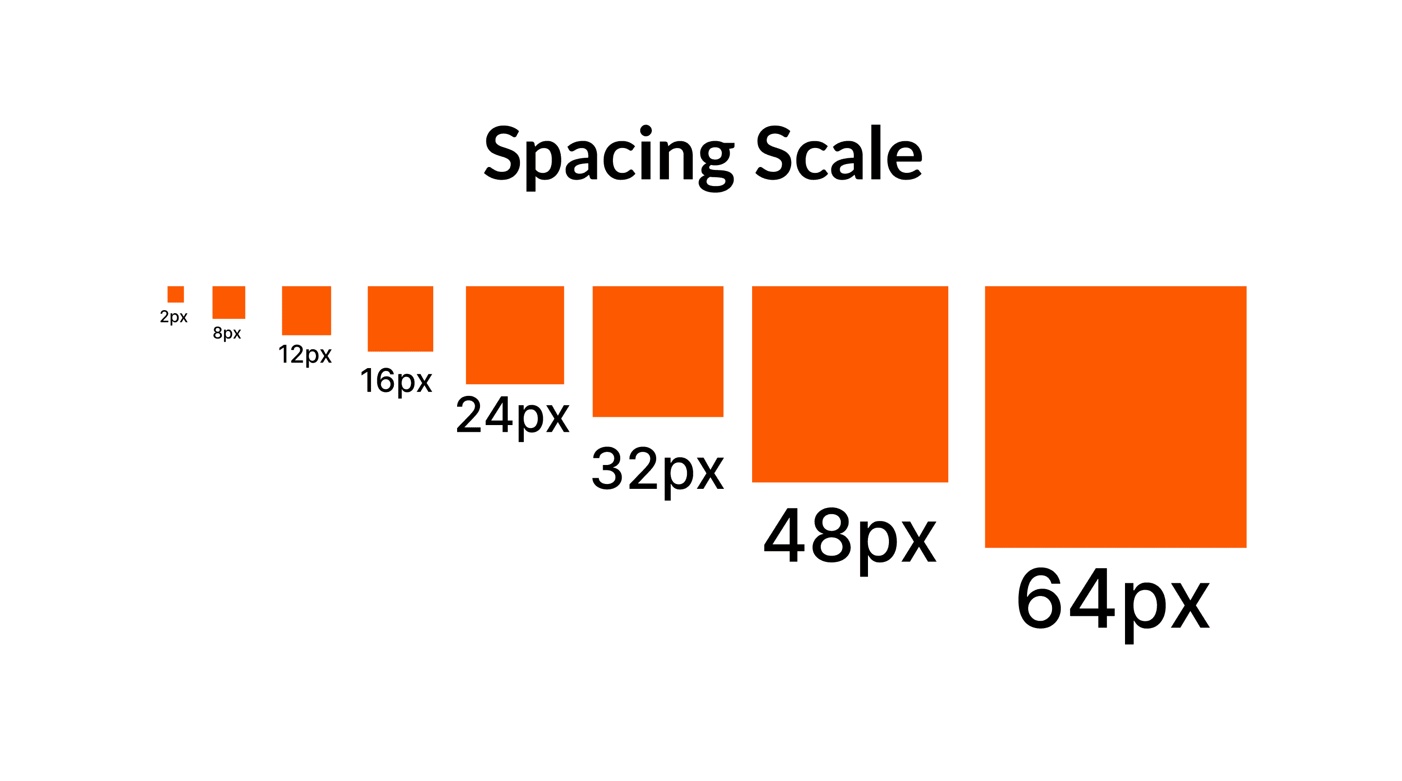
Spacing Scale
A consistent system of spacing (e.g. 4px, 8px, 16px, 24px, etc). Why it matters: Makes layout predictable and speeds up design decisions.
Spacing Isn’t Just a Detail — It’s the Backbone of Good Design
Without proper spacing, a design is like a house with no walls—everything’s cluttered and overwhelming. Use each type of spacing with purpose: padding for tap comfort, margin for clear layout structure, line height for readability, and whitespace to guide focus. These aren’t just decorative touches—they’re powerful tools for visual communication. Take a look at your design right now—are the spaces consistent, clear, and comfortable to the eye?